


I found this packet of milkweed seeds at the store recently and was inspired to make a Father’s Day card using Distress Oxide Inks based off of it. My father has been growing milkweed in their yard the last couple years, hoping to attract and feed monarch butterflies. But first, I had a happy diversion that took me away from crafting for a couple weeks. We welcomed the newest addition to our little family, the very sweet Rosie.


Little Rosie takes lots of naps, so that means I have some time to craft. Since I’ve been a bit hooked on Distress Oxide inks lately, I pulled out some masculine colors and set to work on my Father’s Day card.
Inspiration and Design
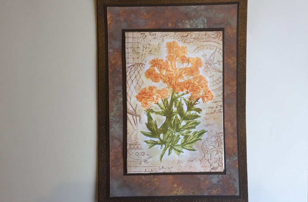
While perusing Pinterest recently, I came across this blog site with the most amazing background. I knew I had to create something similar for the base of my card, but using the colors reflected in my inspiration. I chose to use Vintage Photo Distress Oxide Ink, as well as Spiced Marmalade and Peeled Paint to coordinate with the milkweed stamp.
The flower packet pocket was further inspired by this video. The Crafty Individuals stamps she used had a nice background behind the flowers. But I wasn’t sure if these stamps would be the right size and they weren’t the type of flower I was looking for. While searching for an appropriate stamp to replicate the flower, I found the new Tim Holtz spring release contained a set of flowers. Two of the flowers could easily pass for milkweed.
Next came the search for the stamp to create the background behind the milkweed stamp. Once again, I turned to my Docrafts background stamps, this time pulling out the Steampunk background stamp. It’s a collage of different random elements and filler textures and came closest to the combination of images used in the Crafty Individuals stamp.
I thought a butterfly alighting off the flowers would look nice, and pulled out my Memory Box dies to create a small butterfly. Alas in the end, they were just too vibrant for the subdued masculine colors used on the card. Instead I put two small butterflies on the inside of the card.
Supplies used
In addition to the products mentioned above, I pulled out these products to create the card, in relative order as they appear in the video:
- Brown cardstock from Coredinations pack, Chocolate Lovers (Joanns?)
- Viva Decor, 3D Stamp Paint in Walnut Brown
- Distress Oxide Inks in:
- Peeled Paint
- Spiced Marmalade
- Vintage Photo
- Tim Holtz Stamper’s Anonymous Illustrated Garden
- Archival Ink in Potting Soil and Fern Green
- Hero Arts Orange Ombre ink pad
- Colourarte Twinkling H2Os in:
- Pretty Peridot
- Heavenly Bamboo
- Golden Monarch (I know, right!)
- Apricot Nectar
- Lindy’s Stamp Gang Magicals in:
- Hags Wart Orange
- Rudolph’s Nose Red
- Yellow Rose of Texas
- Memory Box dies Leavenworth 99098 and Cascadia 99095
Pulling It All Together
The Base
Now that I had all my supplies identified and gathered, I set to work. First thing I do when creating a card is figure out what I want it to say on the inside. I usually will print out the sentiment on my inkjet printer if I don’t have an appropriate inside stamp (more common than not). I’ve learned the hard way to do that as the very first thing, rather than when you get to the assembly step. This is especially important if you are using a one-layer base technique. I called on what I learned in this previous post to add shimmer to the card base after the sentiment was adhered to the inside of the card.
The Seed Packet Pocket
Next, I measured the seed packet and made a pocket with a right-hand opening. The pocket panel has 1/2 inch edges that fold under on the top, left, and bottom sides. It is sized 1/8 inch larger for width and height to allow the seed packet to fit. To create the pocket, I cut notches out of the corners and scored along the 1/2-inch edges on the 3 sides.
I aligned the stamp onto the pocket face, making sure I didn’t center it horizontally. I was careful to take into account the left edge that would be folding under to form the pocket. Next, I used the orange ombre ink to color just the flower section of the stamp and stamped it to the pocket face. I cleaned off any orange ink that happened to get on the stems, so they wouldn’t combine with the green ink to create brown stems. Then I used the Fern Green Archival ink to stamp just the stems, again taking care to remove the green ink where orange ink was already stamped.
To add the vintage-y background, I made a mask by tracing around the outer edge of the rubber stamp. Not exact but close enough. I used a small bit of repositionable tape to hold it down to the stamped pocket piece. For this step, I used the Docrafts stamp and the brown Potting Soil Archival Ink to stamp the background, taking care to determine which visual elements I wanted to use on the stamp. The paints have a beautiful shimmer to them.
Once the ink dried, I pulled out my Twinkling H2Os. This was my first time using them and I was excited to see that the stamped image could be seen under the translucent paint.
The Butterflies
After the seed packet pocket was complete, I started on the butterflies. First I pulled out my new Tim Holtz Monarch dies, but they were way too big. So I used my Memory Box buttefly dies instead. I wasn’t sure how I wanted to color the butterfly wings, so I experimented with Lindy’s Magicals, Distress Oxide inks, and Twinkling H2Os in similar colors. In the end, I liked the variability of the Magicals the best. For those who prefer a bit more control, the Twinkling H2Os had a nice watercolor-y look to them as well as some pretty shimmer. I thought the colors on the Distress Oxide inks were just too flat or muted once you layered on the black butterfly outline.

The Assembly
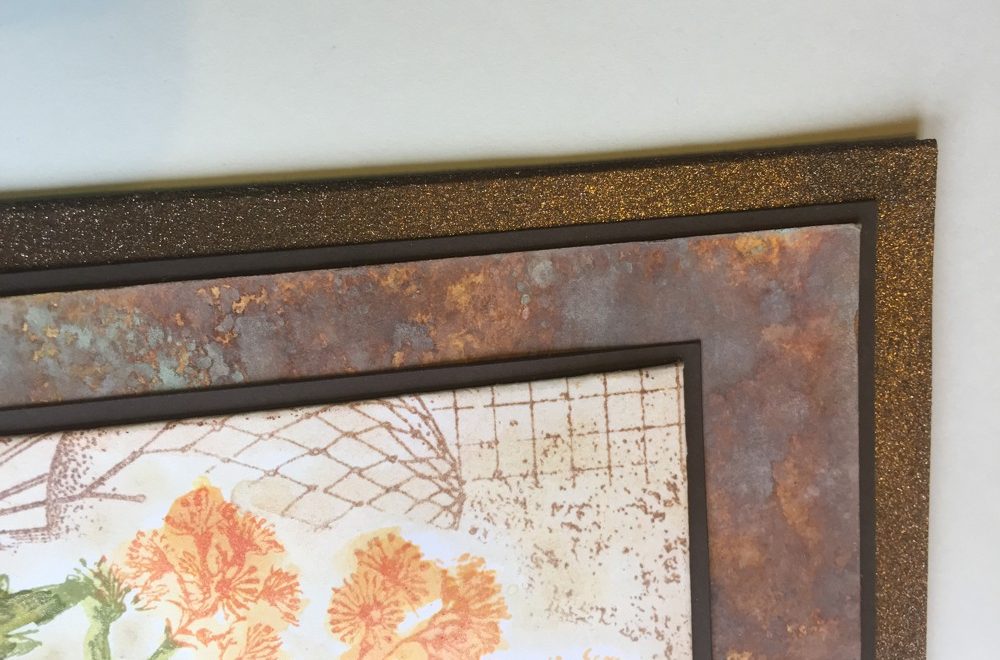
Finally, all my pieces were complete. I wanted a slight border around each layer. The paper collection included a darker brown paper to made a nice border around the pocket and the Distress Oxide layer. See the video for an important tip on how to tape down objects that you want to carefully position. I left a 1/4 inch reveal around the bottom layer to let the beautiful 3D Stamp Paint shine through. The seed packet pocket only had 1/16th inch reveal as well as the Distress Oxide panel. I loved how the Distress Oxide panel came out and didn’t want to cover it up more than necessary. In the end, I skipped using a die cut exterior sentiment. This makes the outside of this card very versatile. It could be used for any masculine occasion.
The Video
Watch the video here as I make a Father’s Day Card using Distress Oxide Inks:


